Color Space - sRGB - Adobe RGB 1998
Table of Contents
1. So what's a color space? 2. The more colors the better right? 3. What about printing? 4. So what do I need to do?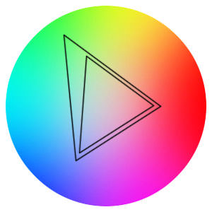
Ever had the problem of washed out colors, either on a print or on the screen? The chances are the reason for it is that you're using the wrong color space somewhere in your workflow.
So what's a color space?
Basically it represents the colors available to use in your photographs, called the color gamut. There are lots of different color spaces but I'm going to limit the scope of this article to the two that you are likely to come across which are sRGB and Adobe RGB 1998.
In the diagram on the right, the inner, smaller, triangle represents the sRGB color space and the outer triangle represents the Adobe RGB 1998 color space. The drawing is just a rough approximation not a scientific measurement. The two things I want to illustrate is that the Adobe 98 color space is bigger, contains more colors, particularly in the greens and cyans. For those who like numbers, the Adobe (1998) color space includes about 50% of all colors and sRGB a mere 35%.
The more colors the better right?
Now you might immediately think, as I did, that more colors must be a good thing so that must be the one to go for. Well unfortunately it's not that simple. Having all those extra colors available is only of any use if the display medium can actually display those colors. And the bad news is, most can't.
Fire up Photoshop and load up a picture, pick something with lots of nice colors and some subtle hues, then make two copies of the picture with two different color profiles. To change the color profile you need to look under the edit menu, near the bottom you will see convert to profile... Set one version of the picture to sRGB and the other version to Adobe RGB (1998). Looking at the two pictures side by side in Photoshop you will see no difference at all. This is because Photoshop is making the necessary adjustments, based on the profile you have set, to display the colors correctly on your screen.
Now close Photoshop and view your pictures in Windows Explorer or any other, non photo specific, software. You should see that the sRGB picture is much the same as you saw it in Photoshop and the Adobe RGB (1998) picture looks very dull in comparison. This is because most other software, including your web browser, defaults to sRGB, and is not able to display the extra colors in your Adobe 98 file. Looking back at the diagram above you can see that the brighter colors in the Adobe 98 picture would be cut off when displayed in an sRGB viewer, leaving you with the muddy colors in the middle range.
What about printing?
Not all photos are destined for the web. What about printers? Sad to say that, unless you have a very high end specialist printer, the color space will be about the same or maybe even smaller. Most printing houses recommend that you submit your files in sRGB and most inkjets, although they actually print in CMYK demand an sRGB input. Offset litho printing uses the CMYK color space, as does all reproduction on paper, this color space is even smaller than sRGB so a lot of rich blues and reds need to be re-calibrated before sending pictures to magazines. I produce a magazine with over a thousand photos in each edition and one of the biggest tasks just before going to press is changing the color mode of all thos photos to CMYK and tweaking each one manually to get the best tonal range.
So what do I need to do?
Even if you are finding the stuff above a bit difficult to get your head around, you can save yourself a lot of pain by making sure that your entire workflow is set to sRGB. This starts with the camera. Unfortunately I don't have access to all the brands of camera on the market but my own experience with Canon cameras is that the default setting for color space is Adobe RGB (1998). You can change this by delving deep into the menus where you will find a color space submenu with two choices on it, change it to sRGB. Some other makes of camera have color space adjustments but they don't call them by the same name. Fuji for instance call theirs something completely different which does rather complicate things. You need to either find out which setting corresponds to sRGB or just try some experiments and see what you like best, only recommended as a last resort.
If you are using Photoshop, on the edit menu there is an item called color settings... , open this and make sure that the first box, for RGB color space is set to sRGB, probably with a few numbers after it like sRGB IEC61966-2.1. This will ensure that any new files you make will have the sRGB color profile embedded automatically.
Check out the color profile options on your printer, sometimes there are limited options but mostly these options refer only to the type of paper you use.
Ideally you should calibrate your monitor with a colorimeter but that might be a bit too expensive for most casual hobbyists. There is free calibration software built into Photoshop called Adobe Gamma, which can be useful but I think I will leave the whole calibration thing for another article.
Set your camera, software and anything else you can tweak, to sRGB. It will definitely improve the consistency of your photos, wherever they are displayed.
Introduction page.
An introduction to the color temperature scale.
How to set up your camera's manual white balance.
Using a gray card for color balance and exposure measurement.
Ever had the problem of washed out colors, either on a print or on the screen? The chances are the reason for it is that you're using the wrong color space.

If you enjoyed this page you might
be interested in my eBook
Learn Photography with Geoff Lawrence